Case Studies
HabitFy - Habit Building App
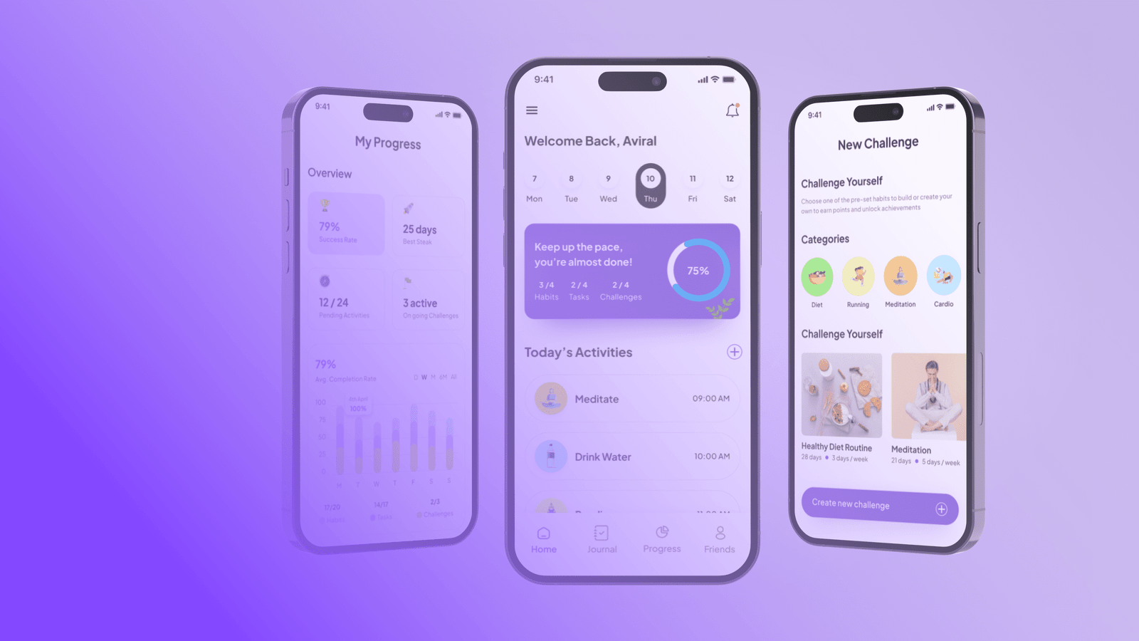
HabitFy is an Habit building app designed to tackle sedentary lifestyle. It enables users to create healthy habits, track progress, socialize, and create reminders, tasks, and challenges for themselves.

Problem Statement
Sedentary lifestyle has become a major health concern globally. People are spending more time sitting than ever before, which has led to various health problems. The core problem that users are facing is the lack of motivation and accountability to develop healthy habits. Users often find it difficult to stay on track with their goals, and the lack of support and encouragement leads to a lack of motivation to continue.
The Goal
The goal of this Application is to create a user-centered design for users that addresses the core problem of lack of motivation and accountability. The aim is to create an engaging and intuitive user experience that helps users develop healthy habits and stay motivated.
User Persona

Information Architecture
We focused on creating a clear and intuitive layout that would allow users to easily find the features they need. We grouped similar features together and used clear labels and icons to make it easy to understand what each feature does. We also created a hierarchy of information, with the most important features and information at the top of the screen.

User Flow
For the user flow, we focused on creating a simple and intuitive process for setting up new habits and tracking progress. We created a step-by-step process for setting up new habits, with clear instructions and prompts to guide users through each stage. We also created a simple dashboard where users could see their progress and get reminders and recommendations based on their habits.

Style Guide
With the information architecture and user flow in place, we moved on to the design stage. We developed a Style Guide that included a color palette, typography, and visual elements that would be used consistently throughout the app. We chose a color scheme that was both visually appealing and easy on the eyes, and selected a typography that was easy to read and legible across different devices and screen sizes.

Wireframing Stage
After Finalising the Design System, we created detailed wireframes for each screen of the app. We tested these wireframes with users to ensure that they were easy to understand and use. Based on their feedback, we made adjustments and improvements to the design.

Final Outcome
After following the Design thinking process, We were able to build an app that was easy to use, intuitive, and effective at helping users develop healthy habits. Users could create custom habits, track their progress, and socialize with others to stay motivated. The app also provided personalized recommendations and reminders based on user behavior, which helped users stay on track and achieve their goals.

Hi-Fidelity Designs

UI Screens


